

An infographic is a blog post condensed into a single high quality image. In an online world of cookie clutter blog posts and regurgitated articles, infographics have become popular with readers as they are more visually appealing to view, and easier to consume.
But they provide businesses greater benefits than just keeping their readers happy, infographics are shared more on social media and are a great way to build quality backlinks:
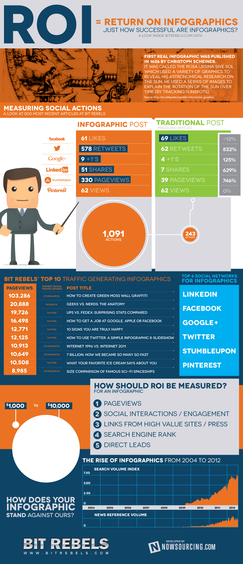
Source: BitRebels
What components go into making a great infographic that will enhance a brand’s content marketing strategy?
1. A relevant theme
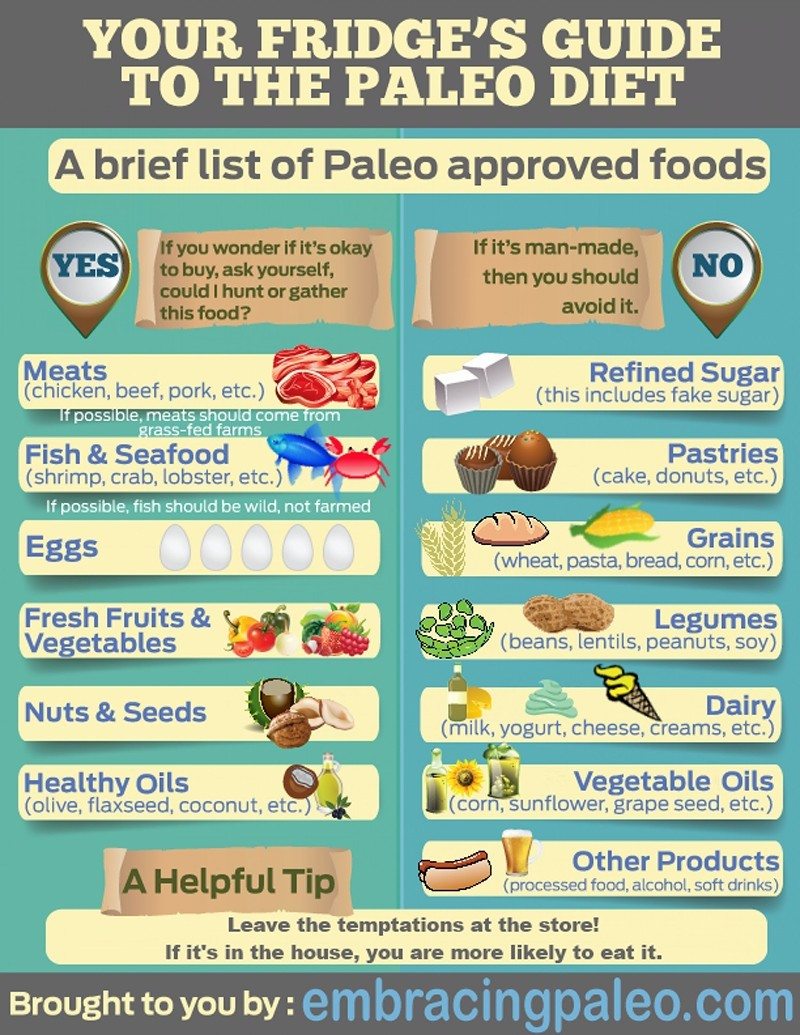
An infographic’s theme is simply the story it wishes to tell. The story should tie in with the business’s brand and industry. For example, Embracing Paleo share tips and knowledge on the paleolithic diet. Their infographic has a relevant theme that relates to their business, and fits in with their brand by not using any jargon or difficult to comprehend information:
2. Double check the facts (and then check them again)
Almost every infographic will list statistics, facts and link out to other studies. Each fact should be double checked and cited to ensure the integrity of the infographic. Showing the wrong numbers or using data from questionable sources can completely destroy an infographic’s credibility and damage a brand’s reputation.
Facts can be checked on Google within seconds and Internet trolls love nothing more than instigating arguments for fun. Double check the facts and ensure each reference is correctly cited at the bottom of the infographic.
3. Dress up the statistics (literally)
Human beings are attracted by beauty – science has proven it. The biggest unique selling point of an infographic is its beauty. Authority figures in the industry are more likely to use and link back to infographics that not only read well, but look the part.
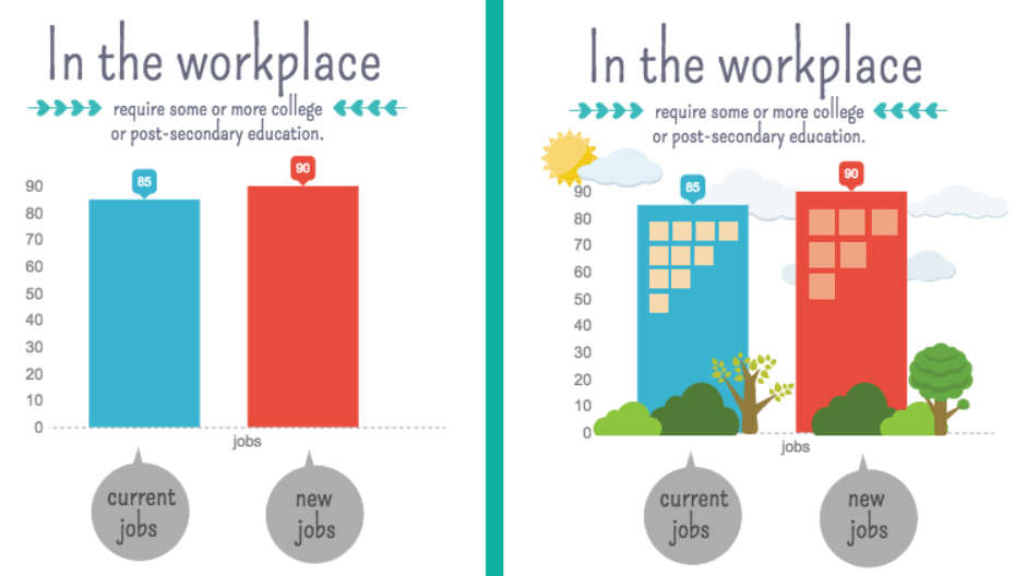
Here are two examples of an image telling the same information, the only difference is the image on the right has been dressed up.
Source: Piktochart
The image on the left is dull and boring, but with a few changes it becomes visually more appealing to read.
A good infographic design adheres to the following rules:
- Simple graphics (no 3D or complex designs)
- Flows well to tell the story and keeps inline with a theme
- Doesn’t overuse too many colors
- Readable font
- Has a brand feeling
- Visuals and data match up
- Isn’t repetitive
- Contains white space
An infographic needs to look great but also be easy on the eyes. 3D infographics or using every color in the spectrum will make it hard for people to read.
4. A compelling title
Just like the headline of a blog or email decides whether the prospect reads or clicks somewhere else, the same principles apply with infographics. A compelling infographic headline describes the content of the infographic, grabs the reader’s attention by evoking emotion and is usually 70 characters or less.
Here’s a great example of an infographic title created by Wix:
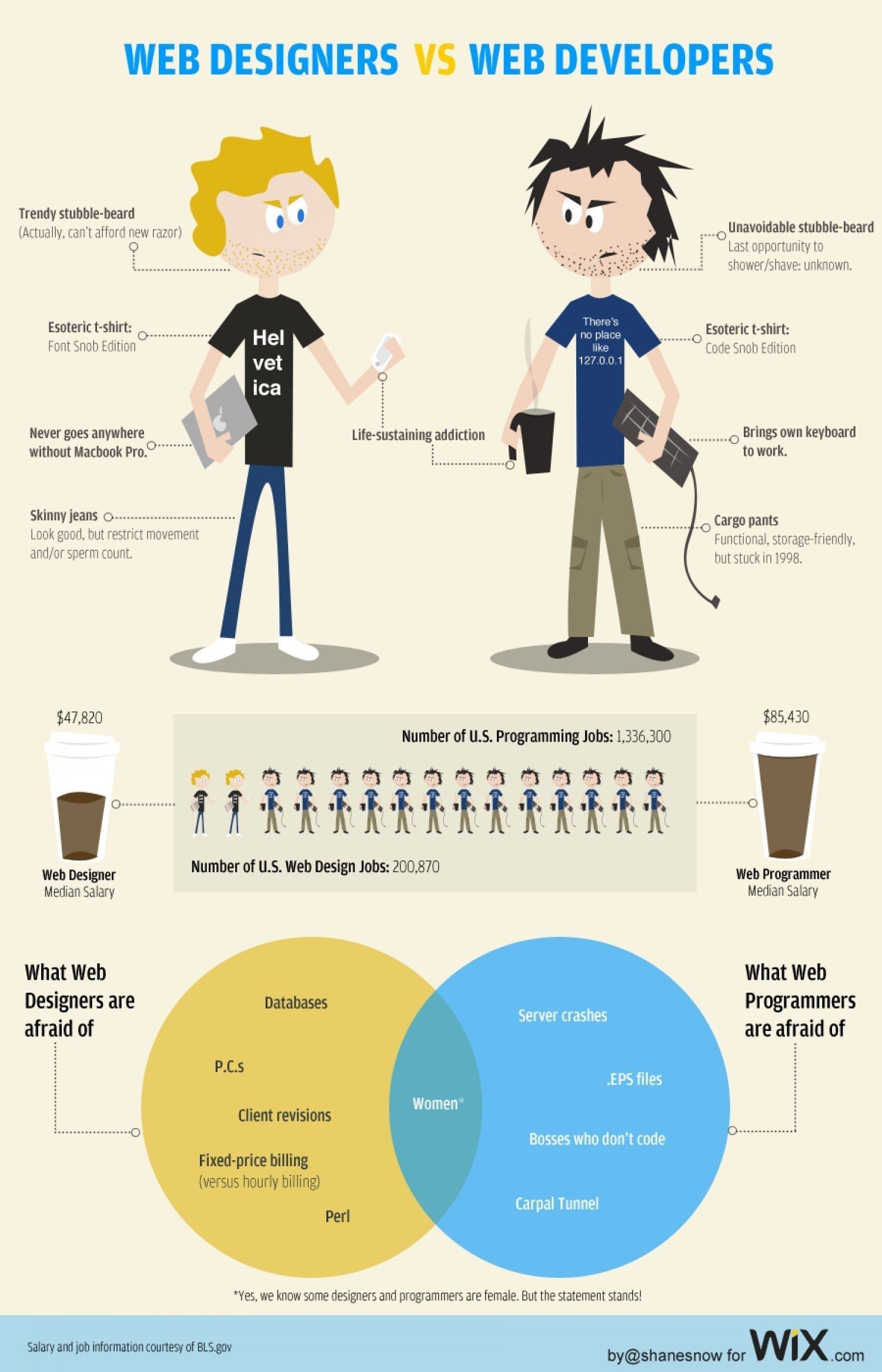
Their headline uses the us verses them social identity theory which compels all designers and developers to click and see what is being said about their “team”.
5. More is not always better
The more data an infographic contains the bigger it is in file size and length. However, not everyone will be viewing it on a 25 inch monitor or on a fast Internet connection, most will be on some form of mobile device using a mobile connection.
As a rule of thumb, most infographics tend use a width of 600-1,100px while keeping under 8,000px in height. Keep infographics within this area and limit the size to 1.5MB or less.
What can infographics help businesses achieve?
A well thought out infographic can dramatically boost a business’s online presence through SEO. As they have the ability to get shared easily, businesses not only boost their site’s search visibility on search engines through the generation of backlinks, but can leverage the links as a way to drive free targeted traffic from those who share it.
At this moment in time, infographics are created by authority-like businesses and can help brands position themselves as an expert in their industry.
Summary
Creating an infographic takes several times longer than a blog post and a eats up a bigger chuck of a business’s content marketing budget. They should not be rushed or be done on the cheap, but approached in a strategic way to construct the right theme, data, size and copy.
